Stay informed with free updates
Simply sign up to the Visual and data journalism myFT Digest — delivered directly to your inbox.
This article is an on-site version of our Climate Graphic: Explained newsletter. Sign up here to receive it in your inbox each Sunday.
The World Meteorological Organization (WMO) this month released its annual to decadal climate update, which details predictions for the global climate over the next five years.
Global mean temperatures are likely to continue at or near record levels between 2025 and 2029. The average global mean near-surface temperature for each year during this period is predicted to be between 1.2C and 1.9C higher than the pre-industrial average.
There is an 86 per cent chance that one year between 2025-29 will exceed 1.5C above 1850-1900 levels. More troubling however is the prediction there is a 70 per cent likelihood that the five-year mean will breach 1.5C.
This does not represent a breach of the 2015 Paris accord target to limit warming since pre-industrial times to well under 2C and preferably to 1.5C, as the threshold is typically measured over at least two decades — but it does set a worrying trend.
This is the first time that scientists’ computer models had flagged the more imminent possibility of a 2C year.
Even though the chances were small — placed at just 1 per cent — the fact that it had emerged in the data set was on the minds of the scientists.
“That was effectively impossible just a few years ago,” Adam Scaife of the Met Office Hadley Centre said.
The WMO report is a consensus forecast based on data from global climate monitoring agencies using computer models developed by institutes, including the Barcelona Supercomputer Center, the Canadian Centre for Climate Modelling and Analysis and Germany’s Deutscher Wetterdienst.
How we made it
To illustrate the key message in the report we turned our attention to a series of maps which highlight the high probability that average temperatures and precipitation would exceed the long-term average in the next five years.
The data was provided on request by the WMO in netCDF format (the preferred format used by scientists for geographic data).
Despite obtaining the data in time to make the graphics on deadline, it would have been preferable if the WMO followed the lead of the European Earth observation agency Copernicus, which provides direct links to the data when the report is released under embargo.
This is best practice when dealing with news media deadlines, when every hour matters.
This data was imported into Qgis, our preferred geographic information system software, and styled using appropriate colour ramps for the subject matter. In the report, a blue-to-red colour ramp is used for temperature and the reverse of red-to-blue for precipitation.

Although red is intuitively interpreted to mean more heat, and blue to mean more rain, there remained the potential for confusion. So we used a different colour scale for precipitation, going from brown-to-blue, to avoid any ambiguity.

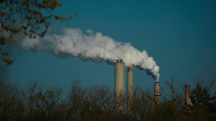
The past 10 years have been the warmest years on record, with “no sign of respite over the coming years, and this means that there will be a growing negative impact on our economies, our daily lives, our ecosystems and our planet”, said WMO deputy secretary-general Ko Barrett.
Climate Capital

Where climate change meets business, markets and politics. Explore the FT’s coverage here.
Are you curious about the FT’s environmental sustainability commitments? Find out more about our science-based targets here