Stay informed with free updates
Simply sign up to the Visual and data journalism myFT Digest — delivered directly to your inbox.
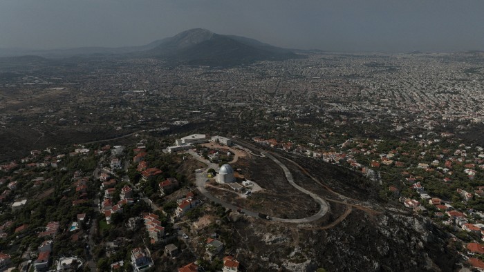
Researchers in Athens are working on predicting wildfires — a notoriously difficult thing to do — at the Penteli Observatory. But last summer the facility was engulfed in flames as a wildfire arrived at its doors much faster and nearer than even the meteorologists working within it had expected.
It was primarily the absence of high winds that saved wider Athens from more widespread and devastating damage. Cities in a similar situation to Athens — urban areas that are very vulnerable to warming-related disasters, but have not seen major disasters yet — are described by the climate scientists as ‘sitting ducks’.
The list of cities includes Dallas, New York, Lisbon, Amsterdam, Sydney and Cape Town, where the risk could be from wildfires or flash flooding. Or — in the worst case — both.
How we made it
To make the interactive globe, I first had to geolocate all of the cities highlighted as being at risk. It is a fairly painless exercise, with help from the excellent Geocode Awesome plugin available in Google Sheets.
Simply add the list of locations into a new spreadsheet, run the geocoding script and, hey presto, latitude and longitude values appear in columns next to them.

The next step is to assign a marker type to each city depending on the nature of the climate risk they are vulnerable to suffering. I designed these icons in Adobe Illustrator and saved them as SVGs (Scalable Vector Graphics). The advantage of having the icons in SVG format as opposed to JPG or PNG is that they stay crisp as they are vector not raster images.
[Nerd note: We’ve written about the differences between vector and raster images in a previous newsletter, if you missed it email us as [email protected] and we’ll forward it to you.]
The spreadsheet of cities and coordinates is then imported into our custom made Flourish map template, which reads this data and places the icons and labels on to a map. I chose a globe over a standard map projection as I find they are more engaging, especially on a mobile phone.

For the Dallas flooding risk map we were provided with census level data by Guidewire HazardHub. The GIS (Graphic Information System) file was over 15MB which is too large to load into Flourish and will cause rendering problems when trying to then load it on a mobile phone.
To reduce the size of the file, I used mapshaper.org — a free website that allows you to upload GIS data, simplify it and download it again. This simplified data was then loaded into Flourish, one of the many data visualisation tools we use at the FT. I then styled the data with a yellow/green/blue colour ramp which felt intuitive for flood data.
The so-called sitting ducks cities have so far been “lucky” to avoid the combination of conditions that will lead to the next disaster, says Erin Coughlan de Perez, a professor at Tufts University, an expert in climate risk.
But the odds are against them after the year to April showed unrelenting global warming, with the temperature rise over the preceding 12 months tracking at 1.58C above pre-industrial levels.
Join us for the Climate & Impact Summit on 21—22 May, held in-person in London as well as online, bringing together business, finance, and policy leaders dedicated to progress towards the UN Sustainable Development Goals through collaboration, innovation and investment. As a valued newsletter subscriber enjoy a 10% discount on your pass here.