Stay informed with free updates
Simply sign up to the Visual and data journalism myFT Digest — delivered directly to your inbox.
At least 151 “unprecedented” extreme weather events hit regions across the globe last year, driven by 2024’s exceptional temperatures caused by record levels of carbon dioxide concentration in the atmosphere, according to a report by the UN’s World Meteorological Organization.
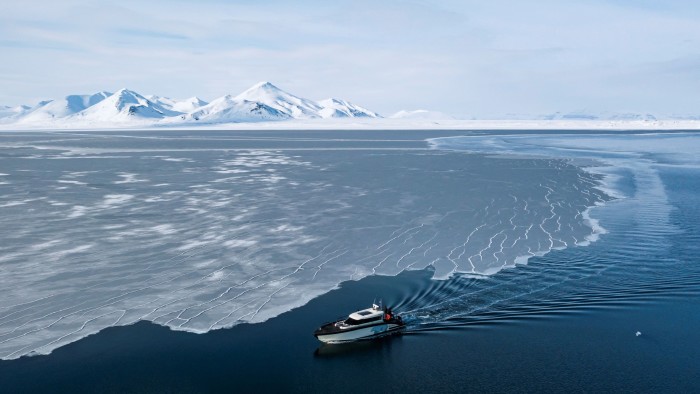
One of the results is that the Earth’s land and sea ice is “melting at an alarming rate”, said WMO secretary-general Celeste Saulo, as the past two years saw record glacier loss.
For this week’s Climate Graphic we decided to focus on a different part of the cryosphere — or the areas of the Earth where water is in solid form — that of sea ice — following a number of recent records at the Earth’
To map the record-low in the Arctic, I referred to the sea ice index provided by the NSIDC. Data is available as daily or monthly averages for the northern and southern poles and in various file formats (csv, geotiff, shapefile).
I downloaded both sea ice concentration and extent for February, as well as the median February extent across 1981-2010.
Using Qgis, the FT’s mapping software of choice, I overlaid the long-term median extent on to the current extent, to create a polygon of the difference, ie the ‘missing’ ice. This separate polygon allowed me to style the area differently (I chose an orange hashed pattern) to draw attention to the areas which previously had been covered with sea ice at this time of year.
A continuous blue to white colour palette selection for sea ice concentration data meant that you could see that although ice is present, density is low in many areas across the Arctic.

For the second graphic, the focus was the ‘missing’ ice. I created proportional squares for each year’s February ice extent anomaly — the difference of that month compared with the long term average. {nerd note: I used RAWgraphs to create the squares, a great free, open source data visualisation tool}.
In a first draft, I aligned the squares by year to create this proportional squares timeline. Years with additional ice were above the axis, years with ice missing were below. The trend of more ice missing in recent years is quite clear, but I wanted to see how animation might help this visual.

In the final version, I cycled through the yearly blocks, leaving a dashed line to show where the previous years’ extents had been. The gradual shift from positive to negative sea ice extents is quite evident in this way.
The 2025 February record is more apparent in this version, as the final square extends beyond the outlines of those previously drawn in the lead up.
While Arctic sea ice extent hasn’t definitively reached its seasonal peak yet at the time of writing, the melting season is about to begin any day now, at which point it will be clear whether this was the lowest maximum winter extent observed to date.
Join us at the Climate & Impact Summit on 21—22 May, hosted in London and online. Bringing together business, finance, and policy leaders, the event is dedicated to driving progress towards the UN Sustainable Development Goals through collaboration, innovation and investment. As a valued subscriber, enjoy 10% off your in-person pass here.